I am back on the blog after a period of silence and neglect. Have been pretty busy in the design field especially on arcbazar.
Arcbazar is a wonderful platform to test one’s skills against architects and designers from all over the world. They have more than ten competitions on at moment and are gaining in popularity with both clients and designers. The quality of drawings submitted is excellent. Entering these competitions has helped me improve my presentations, 3d renderings and has introduced me to very many new ideas.
After winning second prize for the design of the extension of the Islamic Center of New England, I received a honorary mention for the design of a master suite.
 |
| Plan |
 |
| View of Sun room and Porch |
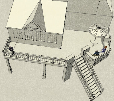
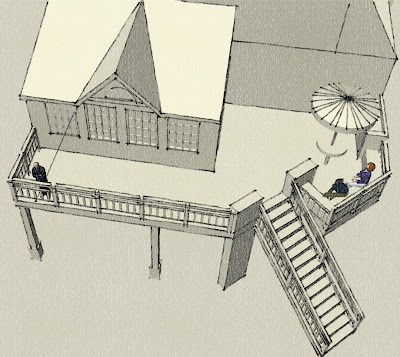
Next a family wanted to add a sun room and porch to their house and alter their kitchen.
The proposal I sent opens up their dining room and kitchen to the new sun room which leads to the deck. The raised deck is unconventional in shape.
It has a cooking area and a table for eating. The diagonal stairs connect to the garden which is a level below.
The roof of the sun room is designed to match the existing roof line and the whole extension merges with the old.
The clients liked it and awarded it a first prize.
Then there was the renovation of a cottage master suite and bedrooms.
Three existing bedrooms and a single bath had to be converted into two bedrooms, two baths and a WIC for the master bedroom.
Was happy with the 2nd prize for this one.
I made my option economical by retaining two bedrooms. I carved out a master bath and walk-in closet from the bedroom next to the existing bath so that plumbing costs could be reduced.
Big fan of the free standing tub and the chair next to it…:)
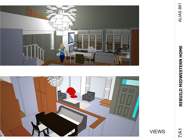
My latest entry was for the redesign of a midwestern home. A beautiful Keck&Keck house has been adulterated by later extensions. The new owners want to restore it to resemble one of the many modern houses designed by the architect duo.
In the option I presented I replaced a curved glass block wall in the front living room with a simple fixed glass angle window to bring in more light.
The third garage is opened up to make a portico and a small unmatched window in the first floor master bedroom replaced by a strip window to strengthen the horizontal lines of the house.
 I redesigned the interior plan, removing the walls to make an open plan. The south wall is replaced by glass, flooding the rooms with light.
Lots of small details, seats on both sides of a new fireplace,a banquette couch for the dining,a PH Artichoke and a red Womb chair helped it bag first prize. It also helped really work on my 3d renderings and pushed me to use VRay for better views.
Thumbs up to that!
—
To view original post please click here.


